
1.17
conversion rate
new users
BEFORE
2.22
conversion rate
new users
AFTER
132
hours/week taking orders
customer support
BEFORE
66
hours/week taking orders
customer support
AFTER
Overview
Context: Plazy is a car dry wash startup, that delivers service at the customer's convenient location, saving 150 L of waters on each order. Their purpose is to save customers' time and have as little as possible impact on the climate.
Challenge: Plazy’s team is used to take all orders by phone or Whatsapp chat. After 6 months, the new website doesn’t seem to make it easier, either for users or the customer service team.
Goals: Increase conversion rate and reduce the percentage of orders taken by the customer service team.
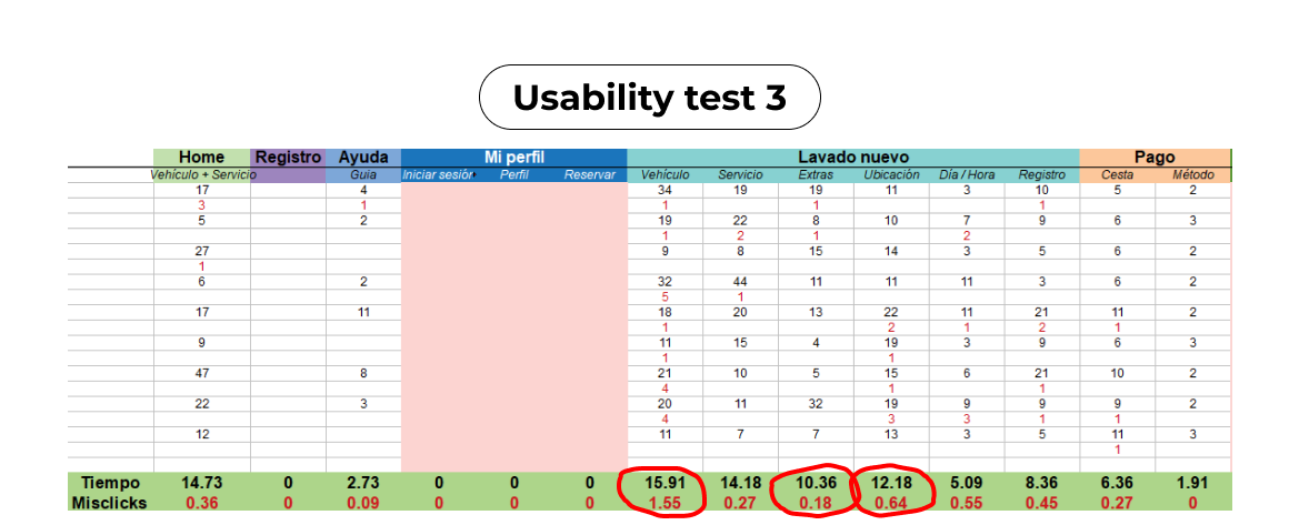
KPIs: conversion rate, time on task new customer, misclick rate, options displayed per decision.
Tools


Time/Location
3 months (2022) /
Barcelona (Spain)

Exploring with customers and stakeholders why the conversion rate is low
For most customers it was easier to book by Whatsapp because the flow was way too long and confusing.
Most of them were happy with the quality of our services and customer support. They also thought that prices were completely fair.
Some customers were upset, they gave away their data to get a message saying that we don't work at their location. 1 of every 3 leads is out of our operational area.
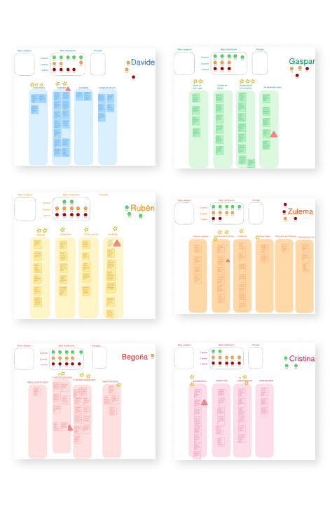
Prioritizing and grouping problems in our first workshop
-

Prioirities
We had two main purposes for this session: problems prioritization and research data exposure.
Most of the problems were grouped into 3 different categories: communication, experience design, or administration.
Our 2 main priorities to work on:
-

Landing page
The landing page doesn't supply all the information users need.
-

New users’ journey
We need to hide the complexity and display the new customers' flow as simple as possible.
How is a current new user’s journey?
An undercover agent from the interviews narrates his first-time experience
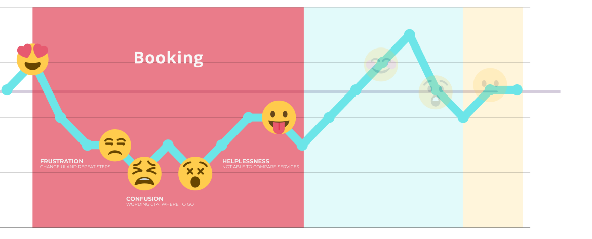
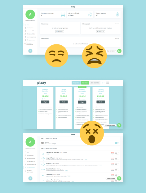
During the first contact with the website he had 3 main breaking points:
Confusion: New UI in the user's profile, selecting once again brand, model, and service.
Unclear next step: 3 different CTAs that bring the user to the same spot.
Lack of consistency: Difficulty to compare services, shaped and described differently.
Read quotes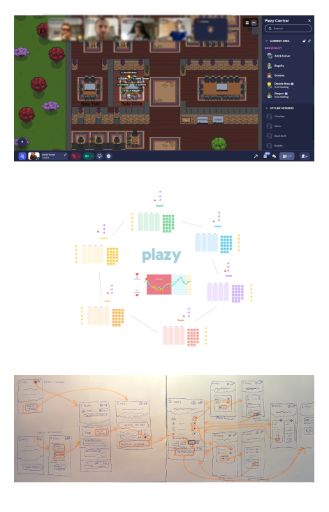
Creating a simpler and more consistent flow for new users
-

Simplify flow
Reducing steps - minimum info required
-

Hide complexity
No account needed, show minimalism
-

Avoid frustration
Informing if we work in user’s location beforehand
-

Keep consistency
Unifying copy, styles, user interface, and branding
-

Reduce cognitive overload
Displaying fewer options for each decision
Working in short design sprints to fix main pain points on the go
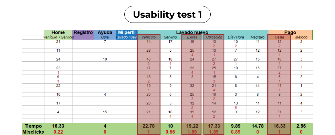
We were able to improve our main KPIs in every round of testing, but time on task and misclicks were not optimal while selecting the car, extras , location and the shopping cart.
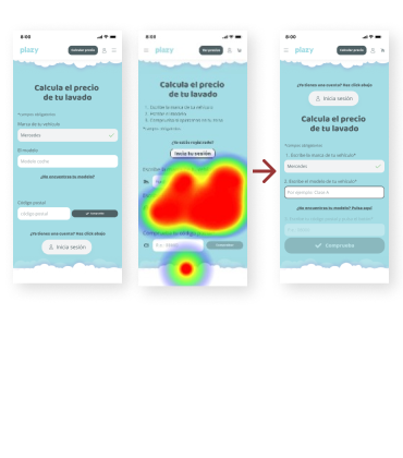
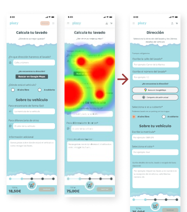
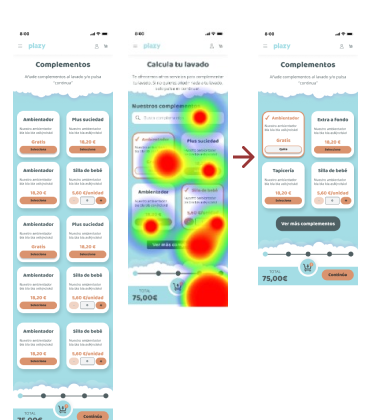
big amount of cards took too much time for items that are not our core business
Selecting complements
Before & After
Zoom in
Check it out!
 plazy.eco
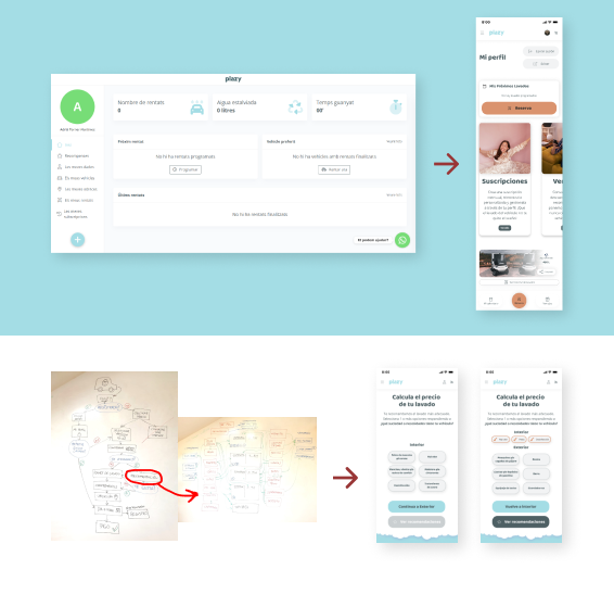
Facing more problems from the discovery phase
New round of UX Writing with the organization’s tone and sense of humor.
Redesign the user’s profile keeping consistency and style (under construction).
Create a new flow to guide the user and recommend the most suitable service based on the customer’s problems/needs (under construction).