
Overview
Context: Re:live, an online news outlet, has three main plans that users can access: Paid subscription (with exclusive content), free newsletters (with different topics), and marketing emails (with deals, discounts, and job opportunities).
Challenge: While designing its signup and onboarding screens, Re:live is finding some problems with how users opt into newsletters or access paid subscriptions. Our team was in charge of conducting a design sprint to understand the user's confusion and explore solutions.
Goals: Increase user satisfaction and conversion rates.
KPIs: ux success, ux progress, donors task success, donors satisfaction, conversion rate.
Tools


Time/Location
2 weeks (2022) /
Berlin (Germany)
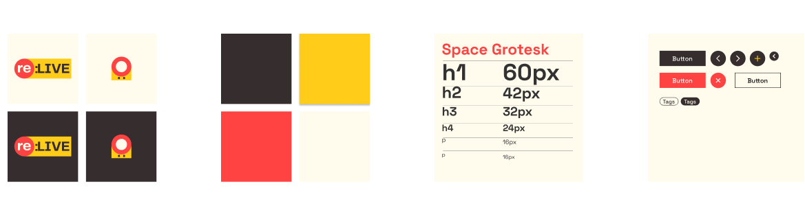
Given personas and styles
Re:live's research and style were supplied to come up with a solution
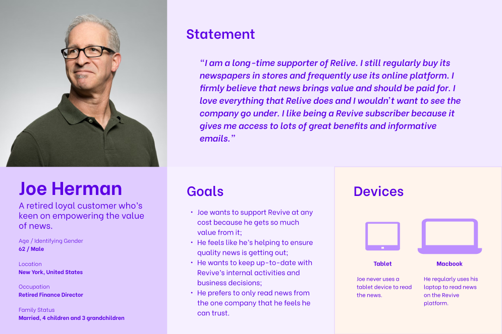
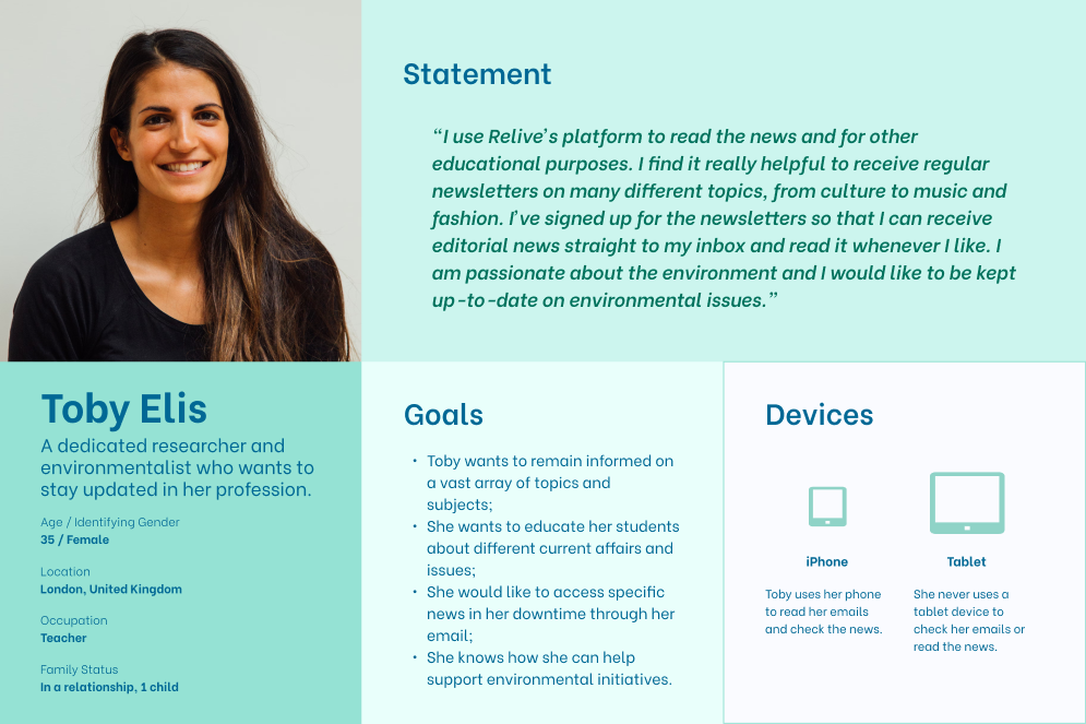
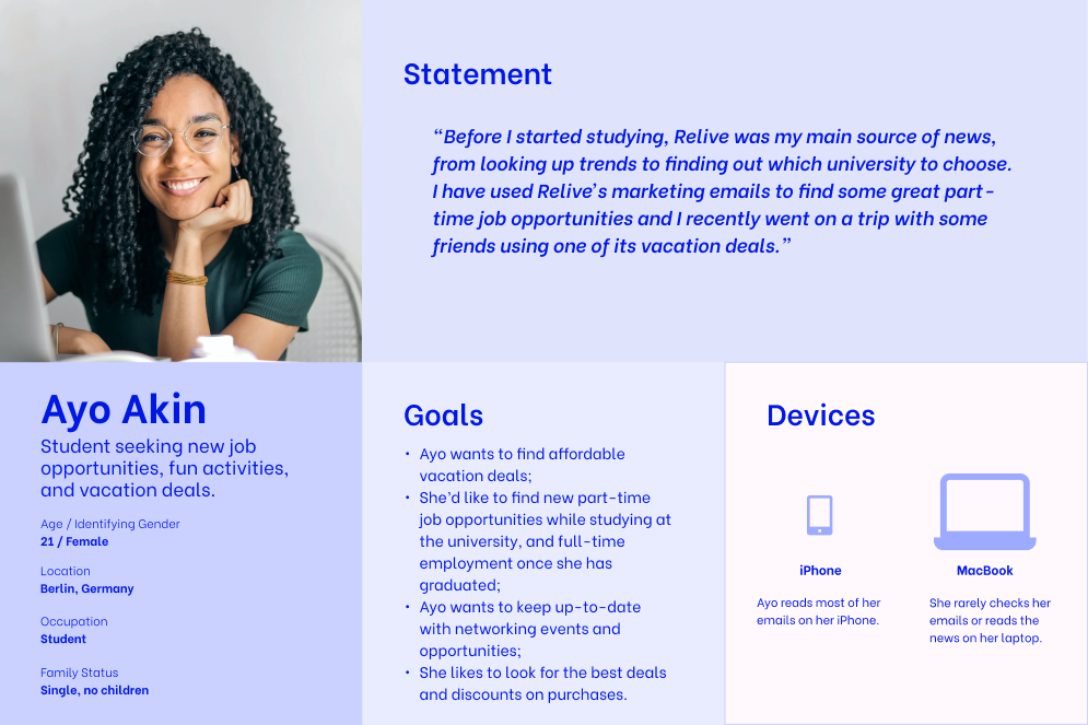
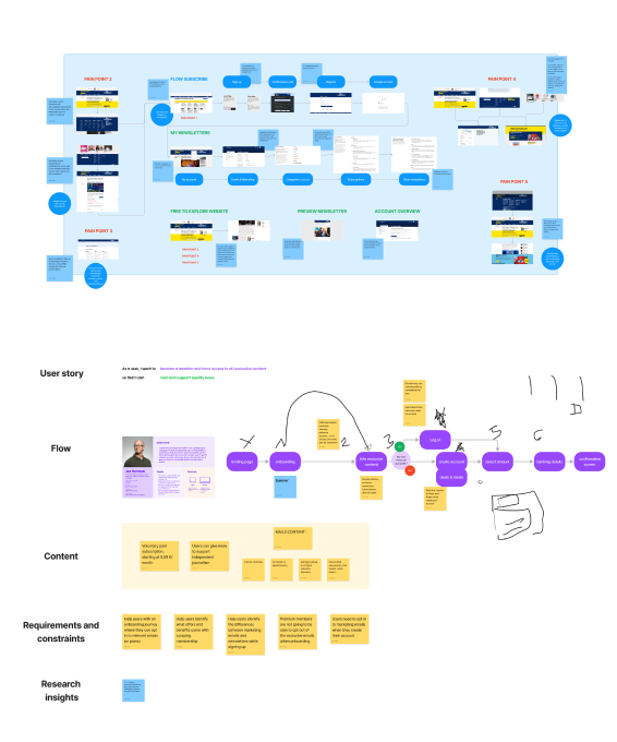
Exposing users' current experiences in our ideation workshop
I facilitated our ideation session, where we had all info at a glance from actual observation, possible flows, or competitors' flows, to our users' needs or the corresponding business constraints related to that persona-flow. The main outcome of our session was:
1. Shared knowledge of our users' problems
2. Polished user flows
3. Identified competitors' best practices

Why are Re:live's plans confusing?
-

Goals
1. Increase the company’s paid subscribers count
2. Create an onboarding flow so that users can difference plans
-

'Paid subscription' problems
- Paid members think they are subscribed to newsletters (they are not)
-

'Newsletters' problems
- Users don’t want to be asked to sign up for newsletters after rejecting marketing emails
- Most newsletter sign-ups happen after marketing emails
-

'Marketing emails' problems
- Most users believe that Newsletters and marketing emails are the same thing
One starting point, different plans, simple flows
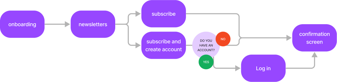
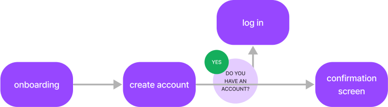
Polished and simplified flows for each one of the main actions (paid subscription, newsletters, marketing emails). Click on them to zoom in

Putting the focus on the problem to design solutions
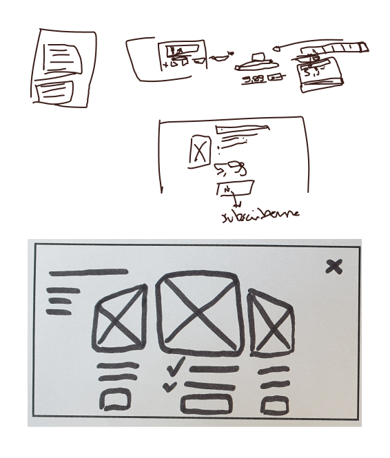
With clear flows and looking for north-star solutions for our main problems, having all constraints in mind, we had a brainstorming session before drawing the first sketches. Our main concerns were:
Onboarding: During the meeting, it was clear that the solution should be one onboarding screen with all plans’ benefits, with the paid subscription standing out in the center
Steps: Reducing steps as much as possible, making users free to explore the site and to know, beforehand, how long is it gonna take to create an account or to sign up for a newsletter

How are we trying to make our users' lives better?
-
'Paid subscription' problems
- Paid members think they are subscribed to newsletters (they are not)
* Show newsletters in cards and explain how it works after completing a paid subscription
-
'Newsletters' problems
- Users don’t want to be asked to sign up for newsletters after rejecting marketing emails
- Most newsletter sign-ups happen after marketing emails
* Work on concise wording, make marketing emails simpler
-
'Marketing emails' problems
- Most users believe that Newsletters and marketing emails are the same thing
* Name marketing emails differently (Deals & Steals) and simplify the flow in a short step during the account creation. To distinguish Newsletters design cards and be consistent with the wording
Wireframing, prototyping, and testing in 4 days
Evolution of our paid subscription and newsletter processes
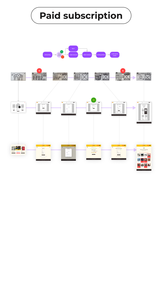
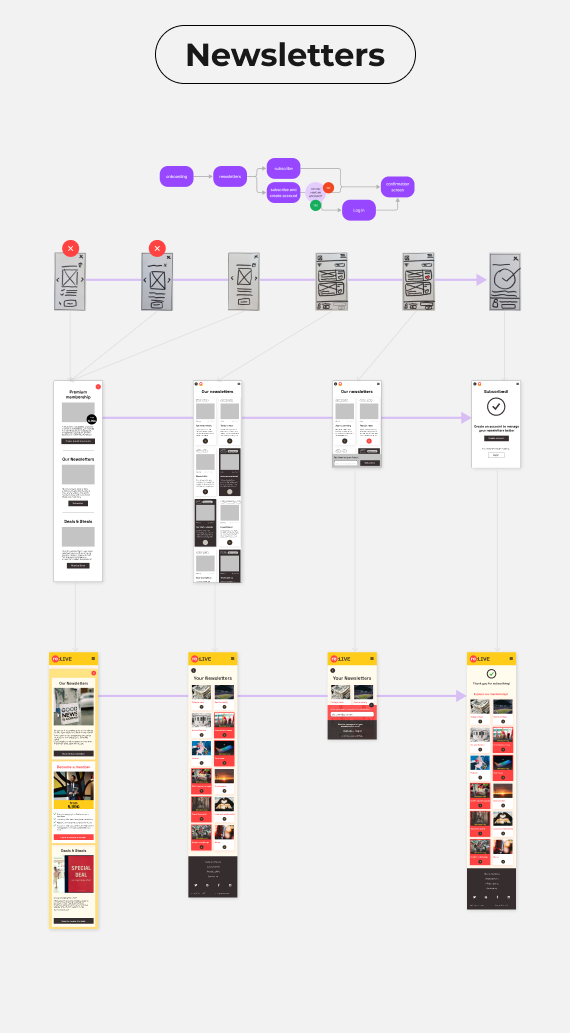
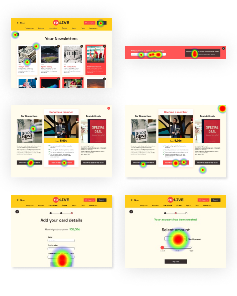
Solving issues with follow-up questions based on heatmaps
-

CTAs
Newsletters’ sign-up process was not completely clear with the button’s overlay.
-

Wording
'Your Newsletters' confused users as if they were already signed up, so instead of signing up, they tried to leave the page.
-

Selecting amount
100 % of testers used the text field to change the amount to donate, never the dragging bar.
-
Deals & Steals
It was hard for users to select the checkbox while creating the account.

Let’s go back to users and check if the wording is consistent enough
-
Wording
Our main issues were related to naming different plans and having a concise and consistent wording for them and the actions, as for “becoming a member”, "sign up" or “paid subscriptions”.
-

Context in landing page
Our work was focused on the onboarding and sign-up flows, so our starting point was a pop-up that should have appeared as soon as a user landed on the homepage. We should work on a consistent design with the landing page.
-

Testing
We can focus on different interface issues and do more preference testing and A/B testing. Images and colors could have a massive impact on the conversion rate, therefore testing different styles and images could bring better results for the business (and the usability).